PRINTING SOLUTIONS
We offer a variety of Direct Marketing Services designed to help you reach your clients more efficiently. From brochures to door hangers to custom postcards, Think Dexter knows what works when creating a marketing piece for your company. A clean professional business presence in the marketing place is vital to maintaining a solid customer base. Staying in contact with past customers through direct marketing such as seasonal postcards, door hangers and flyers is a sure way keep a steady flow of business.
Contact Think Dexter today. (956)867-2900
FULL COLOR
- Postcards
- Event Tickets
- Brochures
- Fold-Over Cards
- Doorhangers
- Greeting Cards
- Posters
- Envelopes
- Notepads/Scratchpads
- Letterheads
- Rack Cards
- Table Tents
- Pocket Presentation Folders
- Booklets
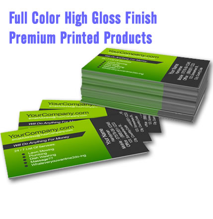
- Business Cards
- Flyers
PRINTING SPOT COLOR
- NCR Forms Spot: Delivery Tickets, Invoices, Patient Forms, Contracts
- Notepads/Scratchpads
- Stickers, Labels, Bumper Stickers, Window Decals
- Prescription Pads
- Envelopes
A client of mine, satisfied with the website pages I had written for him, once asked if I would update his company’s brochure. “Just throw some stuff from the website on it and send me an invoice,” he said. Now I enjoy invoicing as much as the next freelancer, but if my client wanted a brochure that read well and produced results, I knew I would need to put in more effort than a simple copy-and-paste of his Web copy.
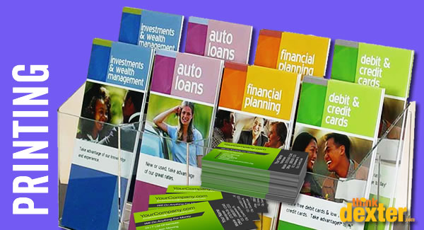
Good brochure writing is a lost art. Thanks to information-dense websites, the lean-and-mean, six-panel folded brochure has lost some of its prestige over the past decade. But that doesn’t make it any less an effective modern sales tool when written properly.
The brochure is a surprisingly versatile marketing piece. You can:
- hand it to prospective clients at sales presentations.
- mail it to interested parties following sales calls.
- insert it into marketing folders at trade shows.
- leave a stack of them in the community area of a local coffee house.
Let’s look at the elements that go into writing a traditional, six-panel tri-fold brochure. We’ll assume you’re working with a talented graphic designer and printer that will transform an 8.5″ x 11″ sheet of paper into a brand-strengthening, deal-closing secret weapon.
Panel 1 – The Front Cover. When folded, this is the first thing the reader sees. Don’t blow it. This panel usually fulfills a few simple goals: identify the company, the need and the product or service. It should be strong enough to get the reader to open the brochure, but not so full of content that he or she won’t need to. This panel is sometimes used as a teaser and may not include a company’s name or logo.
Panel 2 – What’s In It for Them? Here’s where you’ll list the benefits of your service. Remember that clients don’t care what you’re selling unless you communicate the benefits to them. Will their work or personal lives improve? Will they profit from it? Is it fun? Can they afford to live without it?
Panel 3 – The Product or Service. This panel often precedes Panel 2 and that’s fine—it’s a style choice, but I enjoy a slow, deliberate buildup. It’s a classic selling technique that was used frequently by the late Apple CEO Steve Jobs at his product launches. What have you got to say? Why do I need something new? And, oh, by the way, what is it?
Panel 4 – How It Works. Good job! You’ve piqued the reader’s interest in the first half of the brochure. Now what? This is your chance to give additional details about your product or service. You may also talk about the ordering process or any aspect of the sales cycle that will slowly persuade customers to buy from you.
Panel 5 – The Testimonial. One of the most effective sales strategies is the testimonial. Until a client buys from you, you’re still a gamble in the eyes of the consumer. You need help to close the deal. Choosing unsolicited, smartly-written recommendations from “raving fans” may be the difference between winning and losing business.
Panel 6 – The Call to Action. Whenever a client tells me their brochure doesn’t work, I immediately flip it over to the back panel and look for the call to action. More often than not, it doesn’t exist. So let’s review: You teased them, you told them they need it, you described it, you explained it, you gave them a client’s gushing stamp of approval and then you left the back panel blank so you can mail it. Huh? Are you kidding? You’ve left out the most important part. Make the client pick up the phone, drive to your store or log on to your website. Don’t worry, there will still be plenty of room for mailing information. A call to action may consist of one simple sentence, but it drives sales like nothing else.
Some examples include:
- Call now for a free consultation.
- Act now! Limited time offer.
- Bring this coupon and save 20% off your first order.
- Register today to guarantee your reservation.
Those are the parts of a perfect brochure. It’s not simply “stuff” culled from your website. There’s a strategy involved. Does your brochure contain all six elements listed above?
Now, for my own call to action:
You need a brochure that closes customers as efficiently as your best salesperson.

